How to Choose the Perfect Color Palette for Your Home?
Choosing the perfect color palette for your home isn’t just about picking paint chips; it’s about crafting an environment that reflects your personality, evokes emotion, and creates a space where you can truly thrive. From cozy bedrooms to bustling kitchens, the colors you choose have the power to transform your home into a haven of comfort, style, and self-expression. So grab your paintbrushes and let’s embark on a journey to discover the art of color selection and how to curate a palette that speaks volumes without saying a word.
Picture this: you walk into your home after a long day, and instantly, you’re enveloped in a warm embrace of colors that soothe your soul and lift your spirits. That’s the magic of a well-chosen color palette. But with endless possibilities and a rainbow of options to choose from, where do you even begin? Fear not, dear decorator – we’re here to guide you through the labyrinth of color theory and help you unlock the secrets to creating a home that’s as vibrant and unique as you are. So roll up
Understanding Color Psychology
Before diving into the world of color palettes, it’s essential to understand the basics of color psychology. Colors have the power to evoke emotions, influence behavior, and impact perception. Here’s a brief overview of common colors and their associated psychological effects:
- Red: Stimulating and energetic, red is often associated with passion, power, and warmth. It can create a sense of excitement and intensity.
- Blue: Calming and serene, blue is known for its ability to promote relaxation and tranquility. It’s often used to create a sense of stability and trust.
- Yellow: Cheerful and uplifting, yellow is associated with happiness, optimism, and creativity. It can add warmth and brightness to a space.
- Green: Refreshing and rejuvenating, green is closely linked to nature and growth. It symbolizes harmony, balance, and renewal.
- Purple: Regal and mysterious, purple is often associated with luxury, creativity, and spirituality. It can evoke a sense of sophistication and elegance.
- Orange: Energetic and vibrant, orange is known for its warmth and enthusiasm. It can create a sense of excitement and vitality.
- Neutral Tones: Colors like white, beige, and gray are often used as neutral tones. They provide a versatile backdrop for other colors and can create a sense of balance and simplicity.
Understanding how different colors impact mood and atmosphere is the first step in choosing the perfect color palette for your home.
Assessing Your Space and Lighting
Before selecting colors for your home, it’s essential to assess your space and lighting conditions. The amount of natural light, the size of the room, and the existing architectural features can all influence how colors appear. Here are some factors to consider:
- Natural Light: Rooms with ample natural light can accommodate a wider range of colors. Consider how sunlight affects the colors throughout the day.
- Artificial Lighting: The type of artificial lighting, such as warm or cool-toned bulbs, can impact how colors are perceived in the evening.
- Room Size: Dark colors can make a small room feel cozy but may overwhelm a larger space. Lighter colors can create an illusion of space and airiness.
- Architectural Features: Consider existing elements such as flooring, furniture, and fixtures when choosing complementary colors.
By taking these factors into account, you can ensure that your chosen color palette enhances the unique characteristics of your space.
Establishing a Mood and Theme
Once you’ve assessed your space and lighting, it’s time to think about the mood and theme you want to create. Your color palette should reflect your personal style and the atmosphere you wish to achieve. Consider the following questions:
- What mood do you want to evoke? Do you prefer a calm and serene atmosphere or a lively and energetic vibe?
- What is the function of the space? The colors you choose for a bedroom may differ from those in a kitchen or home office.
- Do you have a specific theme or inspiration? Whether it’s coastal chic or urban industrial, your color palette can help reinforce your chosen theme.
By establishing a clear mood and theme, you can narrow down your color options and create a cohesive and harmonious look throughout your home.
Exploring Color Schemes
Color schemes are a structured approach to selecting colors that work well together. There are several classic color schemes to consider, each offering its own unique aesthetic appeal:
Exploring Color Schemes
A monochromatic color scheme involves using variations of a single color. This creates a harmonious and unified look that is easy on the eyes. For example, a room decorated in shades of blue, from pale sky blue to deep navy, creates a serene and sophisticated atmosphere.
Analogous
An analogous color scheme involves using colors that are adjacent to each other on the color wheel. This creates a cohesive and harmonious palette with subtle variations. For example, pairing shades of green, blue, and teal creates a calming and natural aesthetic.
Complementary
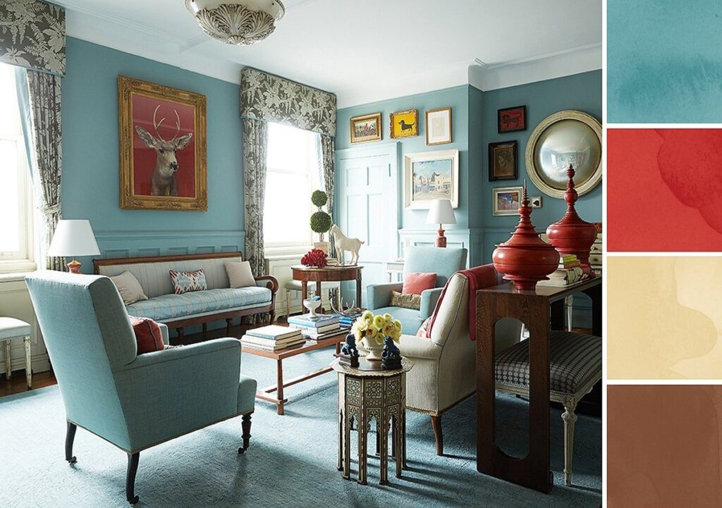
A complementary color scheme involves using colors that are opposite each other on the color wheel. This creates a dynamic and visually striking palette with high contrast. For example, pairing shades of blue with accents of orange creates a vibrant and energetic look.
Triadic
A triadic color scheme involves using three colors that are evenly spaced around the color wheel. This creates a balanced and visually appealing palette with a diverse range of hues. For example, combining shades of red, yellow, and blue creates a bold and playful aesthetic.
Neutral
A neutral color scheme involves using colors such as white, beige, gray, and taupe. These colors provide a versatile backdrop for other colors and can create a sense of sophistication and elegance. For example, pairing shades of white and gray with accents of wood and metallics creates a timeless and refined look.
Exploring different color schemes allows you to find the perfect balance of hues, tones, and shades that complement your space and personal style.
Testing and Sampling Colors
Once you’ve narrowed down your color options, it’s time to test and sample the colors in your space. Paint swatches and samples are invaluable tools for visualizing how colors will look on your walls. Here are some tips for testing and sampling colors:
- Paint Swatches: Start by collecting paint swatches in your chosen colors. Place them against your walls and observe how they look in different lighting conditions throughout the day.
- Paint Samples: Purchase small paint samples in your selected colors and apply them to a small section of your wall. This allows you to see how the colors look in your space and how they interact with other elements.
- Consider Finishes: Keep in mind that different paint finishes, such as matte, eggshell, or semi-gloss, can affect how colors appear. Test samples in different finishes to find the perfect match.
By testing and sampling colors, you can ensure that your final color palette enhances the beauty of your space and achieves the desired mood and atmosphere.
Bringing It All Together
Choosing the perfect color palette for your home is a highly personal and rewarding process. By understanding color psychology, assessing your space and lighting, establishing a mood and theme, exploring color schemes, and testing and sampling colors, you can confidently create a space that reflects your unique style and personality. Whether you opt for soothing neutrals, vibrant hues, or a combination of both, the key is to choose colors that resonate with you and make you feel at home. So go ahead, unleash your creativity, and transform your living space into a place you love to live, work, and play in.