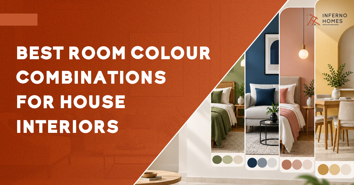
Choosing colours for your home can be exciting yet overwhelming. The right Room Colour Combinations should complement your furniture, lighting, room size and mood while creating a balanced, welcoming and stylish interior.
Then, like a bolt from the blue, your interior designer asks, “What colour do you want for your home?” Whether you are planning a complete makeover or just styling a brand-new blank slate, consulting with experienced interior designers can turn an overwhelming task into an exciting journey.
You are suddenly perturbed. With over millions of shades and combinations to choose from, finding the right colour combination for house interiors can feel overwhelming.
Relax, you are not alone! Let’s take a look at how you can pick colours to help your home feel more like your own.
Key Takeaways
- The 60-30-10 rule keeps any room colour combination balanced and easy on the eye.
- Bedrooms and pooja rooms work best with soft, calming shades.
- Living rooms and dining spaces can handle bolder, deeper accent colours.
- Light colour combinations open up small rooms and low-light spaces.
- Dark shades add depth but work best used selectively, not on every wall.
- Always test paint samples in both natural and artificial light before finalising.
- Match your colour combination for house interiors with existing furniture and flooring.
- Vastu suggests lighter shades for pooja rooms and calmer tones for bedrooms.
How to Choose a Colour Combination for Your House
Start by considering the mood you want to create, and then work around your furniture, room size, and lighting. Once you have cracked the space, your colour palette must be built around three major roles: a primary colour that sets the tone, a complementary shade that adds depth, and lastly an accent colour that adds a bit of personality.
The secret of cracking a deadly colour combination lies in not overcomplicating it and creating a room that’s welcoming and colourful. Implementing the 60-30-10 rule would solve half your problems. And lastly, consider how the shades would look throughout the day in natural and artificial lighting before finalizing the colour combination for house interiors.
If you are selecting a new colour palette as part of a Home renovation, consider your existing flooring, furniture, cabinetry, lighting, and finishes so the new shades blend naturally with the overall space.
Best Room Colour Combinations
Colours have got the power to lift one’s mood. Adding the right shade to your home and wall interiors not only enhances the look of space but can influence how it feels. The right colour palette must complement the purpose of the room, furniture, available light, and overall style. Here are some high-end and versatile colour combinations you can consider for different spaces:
Living Room Colour Combinations
The living room is where you welcome guests and spend time with family, so the colours should create a warm and inviting atmosphere. The following combinations may be helpful:
- Beige + White: A classic combination that creates an open, airy space and works particularly well with wooden furniture.
- Light Grey + White: Perfect for a contemporary style, it provides a neutral base for brightly coloured décor.
- Cream + Terracotta: Adds warmth and character without being too bold.
If you need more contrast, you can introduce deeper shades through an accent wall, cushions, rugs or artwork.
A compact room doesn’t have to compromise on style. If you are working with limited space, these simple living room interior design ideas can help you create an inviting space while adding a touch of class.
Pro Tip: Use the lighter shade on larger wall areas and introduce the deeper colour through furnishings or one accent wall to keep the room visually balanced.
Bedroom Colour Combinations
Softer colours are a good choice since your bedroom should feel calm and comfortable. If you are looking for the best room colour combination for bedroom interiors, consider the following:
- Soft Blue + White: Creates a fresh and relaxing atmosphere.
- Sage Green + Beige: Creates a grounded and calming atmosphere.
- Lavender + Cream: Adds a subtle touch of colour while keeping the space soft.
- Beige + Warm Brown: Creates a cosy and sophisticated appearance.
Don’t forget to test your selected shades in both natural and artificial light before making a final decision.
Pro Tip: Keep the wall behind the bed slightly deeper than the remaining walls to create a subtle focal point without making the bedroom feel heavy.
Kitchen Colour Combinations
There are already several visual elements in a kitchen, such as appliances, countertops and cabinets. Hence, a balanced colour scheme can prevent the space from feeling crowded.
- White + Natural Wood: Keeps the kitchen bright while adding warmth.
- White + Grey: A clean and contemporary combination.
- Cream + Brown: A softer option that works well with traditional interiors.
If your cabinets or backsplash already have a strong colour, neutral walls can help create visual balance without competing with them.
Do you want to set up a stylish modern kitchen interior design but don’t know where to start? Explore customised solutions from our experienced Kitchen interior designers.
Pro Tip: Choose wall colours only after considering the cabinets, countertops and backsplash, as these fixed elements should guide the overall kitchen colour palette.
Pooja Room Colour Combinations
Pooja rooms are usually kept simple and calm, since this space is meant for quiet reflection. These combinations suit most pooja room styles:
- White + Gold: Adds a traditional, pure feel.
- Cream + Maroon: Brings warmth with a touch of tradition.
- Light Yellow + White: Keeps the space bright and peaceful.
- Beige + Brown: Creates a grounded, earthy tone.
Avoid dark shades in this room, since lighter tones suit its calm purpose.
Pro Tip: Use gold, maroon or wooden tones as small accents through the mandir, frames or décor rather than applying them across all the walls.
Kids’ Room Colour Combinations
A kids’ room should feel playful and bright, without becoming too loud or chaotic. If you are looking for the best colour combination for a child’s room, these pairings work well:
- Sky Blue + White: Keeps the room bright and calm.
- Mint Green + Cream: Adds a fresh, gentle touch.
- Yellow + Grey: Balances energy with a neutral base.
- Coral + White: Brings warmth without feeling too busy.
Choose washable paints for kids’ rooms, since walls see a lot of wear and tear.
Pro Tip: Keep the main walls neutral or pastel and introduce brighter colours through storage units, bedding, artwork and accessories so the room can be updated easily as your child grows.
Bathroom Colour Combinations
Bathrooms are often small and damp, so colours should keep the space feeling clean and open. Consider these combinations for your bathroom walls and tiles:
- White + Aqua Blue: Gives a fresh, spa-like feel.
- Grey + White: Creates a modern, easy-to-clean look.
- Soft Green + White: Adds a calm, natural touch.
- Charcoal + White: Works well for a bold, compact bathroom.
Pick moisture-resistant paint finishes, since bathrooms face constant humidity.
Pro Tip: In smaller bathrooms, keep most surfaces light and use darker shades only on one wall, vanity unit or tile section to prevent the space from feeling cramped.
Home Office Colour Combinations
A home office should help you focus, without feeling dull or lifeless. These colour pairings work well for a productive workspace:
- Navy Blue + White: Adds focus with a crisp, clean base.
- Grey + Mustard: Balances calm with a touch of energy.
- Sage Green + White: Creates a steady, distraction-free mood.
- Beige + Charcoal: Gives the space a grounded, professional feel.
Keep your desk wall lighter, since darker shades work best as accents.
Pro Tip: Avoid using highly saturated colours across every wall. Keep the area around your desk calm and use stronger shades behind shelving, artwork or on a single accent wall.
How to Choose the Right Colour Combination for Your House
- Start with the room’s purpose
Bedrooms generally benefit from calmer colours, while living rooms and dining spaces can easily handle bolder, more energetic accent shades and tones. - Check natural light
Rooms that receive less daylight generally work better with lighter, warmer shades that reflect light and open up the space. - Consider flooring and furniture
Choose colours that complement fixed elements such as tiles, wood finishes, cabinets, countertops and existing sofas or furniture pieces. - Use the 60-30-10 rule
Pick one dominant colour, one supporting shade and one accent tone to keep every room balanced and visually calm. - Test colours at different times
Check paint samples during bright daylight hours and again under your evening lighting before making a final decision.
Colour Combinations for Your House Interiors
| Room | Recommended Combination | Best For |
| Living Room | Beige + Warm White | Bright, timeless interiors |
| Bedroom | Sage Green + Beige | Calm and relaxing spaces |
| Kitchen | White + Natural Wood | Modern, clean kitchens |
| Dining Room | Olive Green + Cream | Warm, inviting dining areas |
| Kids’ Room | Pastel Blue + White | Cheerful, airy rooms |
| Home Office | Sage Green + Off-White | Calm, focused workspace |
| Bathroom | Aqua + White | Fresh, spacious appearance |
| Pooja Room | Cream + Soft Yellow | Warm, peaceful atmosphere |
Dining Room Colour Combinations
There’s more space for playing with colours in the dining room, especially if the rest of your house follows a limited colour palette. Since this is a space meant for eating and conversation, bolder colours can complement the setting without overpowering the room.
- Deep Blue + Off-White: Creates a subtle contrast that works well with minimalist furniture.
- Olive Green + Cream: Adds a subtle touch of nature to the dining area.
- Rust + Soft Beige: Introduces colour while maintaining a balanced look.
Colour can also be used selectively on one wall or through dining chairs, artwork and table decor. This helps add personality without overwhelming the space.
Light Colour Combinations for Rooms
Using lighter shades in interior spaces can make a room feel more open and airy, particularly when natural light is limited. If you are looking for options that work across various interior styles, you can consider the following:
- White + Beige: Perfect for small spaces such as living rooms, this combination allows furniture and decor to stand out against walls that are not visually distracting.
- Cream + Light Brown: Best for living rooms with wooden furniture, this pairing creates continuity between the walls, flooring and furnishings.
- Pastel Blue + White: Suitable for bedrooms and relaxation areas, these hues create a subtle visual ambience without making the space feel monotonous.
- Soft Green + Off-White: Best for nature-inspired interiors, this combination pairs well with indoor plants, wooden finishes and natural textures.
- Peach + White: Perfect for bedrooms, dressing areas and children’s rooms, peach adds dimension and colour while white keeps the overall palette balanced.
- Light Grey + Soft Pink: Best for contemporary interiors, this pairing works particularly well with white furniture, metallic accents and minimalist decor.
Pro Tip: Balance light walls with darker furniture, flooring or decor to add contrast. Always test your shades in natural and artificial lighting before finalising them.
Dark Colour Combinations for Walls
Dark colour combinations for walls can give a room more depth and contrast while creating a slightly more dramatic look. When paired with lighter colours and adequate lighting, deeper shades can add character without making the space feel too heavy.
Here are some combinations you can consider:
- Navy Blue + White: Ideal for bedrooms and living rooms, this combination creates a striking contrast while keeping the overall space balanced.
- Charcoal Grey + Beige: Works well in modern interiors, with beige helping to soften the deeper grey.
- Deep Green + Cream: Pairs well with wooden furniture and natural textures, giving the room a sophisticated, earthy feel.
- Chocolate Brown + Off-White: A good choice for larger spaces, as the lighter shade helps balance the depth of the brown.
- Burgundy + Soft Grey: Suitable for dining or living areas, this combination adds richness without requiring too many additional accent colours.
- Deep Teal + Warm White: Works particularly well on an accent wall, adding colour while keeping the overall palette balanced.
Pro Tip: Use darker shades selectively rather than covering every wall. Pair them with lighter surfaces and adequate lighting to keep the room balanced.
The 60-30-10 Colour Rule in Interior Design
The 60-30-10 rule is a simple guideline for using colours to create a balanced room without making it look too dark, dull or overcrowded. It divides your interior colour combination into three proportions:
- 60% – Primary Colour: This is the dominant colour in the room, usually covering the walls, ceilings or other large surfaces. Think white, beige, cream or light grey.
- 30% – Secondary Colour: This complements the primary colour and adds depth to the room. It can be introduced through furniture, curtains, carpets, cabinets or larger decor pieces.
- 10% – Accent Colour: This is where you introduce a stronger colour to create contrast and add personality. Lamps, cushions, smaller pieces of artwork and rugs can all be used to bring in the accent shade.
Common Mistakes to Avoid When Choosing House Colours
You never get a second chance to make a first impression, and the colours of your house are undoubtedly part of that first impression. Avoid these common mistakes when choosing your house colours:
- Selecting Randomly: Avoid choosing a combination just because it looks good on a tiny paint strip. Test how the colours actually look in your space.
- Neglecting Furniture: Your interior colour combination should complement your furniture; otherwise, the colours may look out of place.
- Not Taking Advice: There is no harm in consulting an expert when choosing the right colour combination. You could end up paying a much heavier price if you get it wrong.
- Using One Colour: You don’t want your house to look like an estranged apartment, do you? Pick complementary colours that give each space its own character.
- Ignoring Lighting: A colour can look completely different under natural and artificial lighting, so always check your shades under both.
- Skipping Samples: Don’t commit to a colour without seeing a proper sample or visual reference in your actual space.
If you are a staunch believer in spatial arrangement and orientation of buildings then ignoring Vastu could be a blunder, especially for home mandir. Study the practical tips for home mandir direction as per your vastu before building one.
Bottom Line
When it comes to picking the right colour combination for house interiors, there is more to it than simply choosing a shade that looks good on paper. From setting the mood to understanding how different colours work together and influence the overall look of a space, it can be one of the more tedious parts of designing your dream home.
At Inferno Homes, we believe every dream home deserves a little colour. From designing your interiors and mapping out every intricate detail to helping you zero in on the right colours, finishes and furnishings, our team works with you to bring your vision to life.
We add colour to your dreams and turn them into a home you can truly call your own.
FAQs
1. Which colour is best for interiors?
Neutrals like white, beige, cream and light grey are all great colour options, but the right choice depends on the room, lighting and overall style.
2. What are the 7 types of colour schemes?
Monochromatic, analogous, complementary, split-complementary, triadic, tetradic and square are the seven common colour schemes.
3. What is the 3 colour rule in interior design?
The 3-colour rule is typically applied through the 60-30-10 approach, where you have a primary colour, a secondary colour and an accent colour.
4. Which two colour combinations are best?
Beige and white and blue and white are two popular combinations that work well with many different interior styles.